
A website can look perfectly simple on the screen while the code underneath is quietly reenacting the fall of Rome.
A button needs changing. Easy enough.
Except there are apparently four versions of that button.
One lives in components/, another in shared/, a third is technically a link with button CSS, and the fourth was created eighteen months ago by someone who has since escaped the company.
Change the wrong one and nothing happens.
Change the right one and six unrelated pages move three pixels to the left.
Excellent.
This is one of the reasons I like Atomic Design.
It gives me a way to think about a website as a living anatomy. Small parts combine into larger parts. Larger parts have clear responsibilities. And when something needs changing, I should have a pretty good idea of what owns it, where it lives, and what else that change might affect.
For junior developers, that means spending less time wondering, “Where on earth am I supposed to put this?”
For clients, it means the website is easier to grow without every new feature becoming a tiny renovation project with suspicious wiring behind the drywall.
That's the part of Atomic Design I care about most.
Not the chemistry vocabulary.
Not putting everything into fancy folders.
Giving the website a structure that makes sense as it grows.
Atomic Design
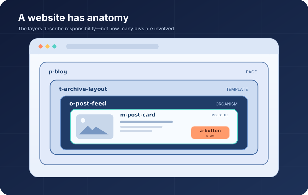
Brad Frost's Atomic Design methodology describes interfaces using five levels:
- Atoms: the smallest reusable interface elements
- Molecules: focused components made from smaller pieces
- Organisms: larger interface regions made from atoms and molecules
- Templates: page-level structures that arrange those regions
- Pages: real instances of those templates filled with actual content
Think of it as moving from something very small to something increasingly complete.
A Button might be an atom.
A Search Form containing an input and Button might be a molecule.
A Header containing navigation, branding, and that Search Form might be an organism.
A page layout arranges those organisms into a template.
Then actual content turns that template into a page.
Atomic design is not a linear process, but rather a mental model to help us think of our user interfaces as both a cohesive whole and a collection of parts at the same time.
That distinction matters.
I don't build seventeen atoms, announce that chemistry class has concluded, and ceremonially begin the molecule phase.
The layers affect one another.
I might build a page and realize the Header needs another component. While building that component, I may discover the Button atom needs another state. Then that new state may reveal something I want to change back at the page level.
Atomic Design gives me a mental map, not a production line.
I take that mental map a little further and use it to organize the actual codebase.
In my projects, an organism is generally a major page section, such as:
- a Header
- a Post Feed
- an Image + Content section
- a Footer
I also avoid putting organisms inside other organisms.
You generally wouldn't describe a lion as containing several smaller zebras, and I'd prefer my component architecture not require David Attenborough to explain it (as much as I'd pay to listen to that).
If something reusable lives inside an organism, it'll usually be a molecule or an atom.
Templates and Pages move away from the biology metaphor, which is fine. The metaphor has already done its job. There's no prize for forcing the entire website into increasingly creative zoology.
The Folder Structure Tells Me What Something Is
One of my favorite parts of this approach is that the project structure itself becomes documentation.
My components might look something like this:
atoms/
  Button/
  Tag/
molecules/
  SearchForm/
  PostCard/
organisms/
  Header/
  PostFeed/
templates/
  ArchiveLayout/
  ArticleLayout/
Before opening any of those files, I already know quite a bit.
A Button is meant to be small and reusable.
A PostCard combines several smaller pieces into one focused component.
A PostFeed is responsible for a larger section of the page.
An ArchiveLayout controls how those larger pieces are arranged.
That same hierarchy also appears in my CSS class names:
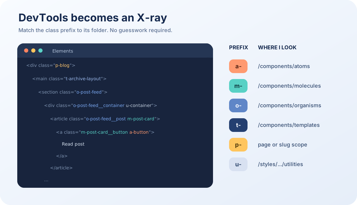
| Prefix | What it means | Example | Likely location |
|---|---|---|---|
a- | Atom | a-button | /components/atoms/Button |
m- | Molecule | m-post-card | /components/molecules/PostCard |
o- | Organism | o-post-feed | /components/organisms/PostFeed |
t- | Template or content type | t-archive-layout | /components/templates or template styles |
p- | One specific page | p-blog | page-specific styles |
u- | Utility | u-container | shared utilities |
These prefixes are intentionally boring.
Boring is wonderful here.
If I inspect an element and see:
m-post-cardI don't need a treasure map, an onboarding document, and a long awaited Zoom call to determine that I'm probably looking for a PostCard in the molecules folder.
The class name has already given me directions.
BEM Tells Me Who Owns What
Atomic Design tells me how large a component's responsibility is.
BEM helps me describe the pieces it owns.
For example:
m-post-card
m-post-card__title
m-post-card__button
m-post-card--featured
m-post-card is the component itself.
m-post-card__title is a piece belonging to that component.
m-post-card__button is the place where the PostCard interacts with a Button.
m-post-card--featured is a variation of the PostCard.
So the Atomic prefix tells me what kind of component this is, while BEM tells me how the pieces inside it relate to one another.
That becomes especially useful when deciding where styles should live.
Ownership Is the Part That Really Matters
This is probably the most important idea in the entire system.
A smaller component should own the things that are always true about itself. A larger component should own the things that are only true because of where that smaller component is being used.
Take a Button.
The Button can reasonably own:
- its padding
- typography
- border
- border radius
- colors
- hover state
- focus state
- disabled state
Those things describe what a Button is.
But imagine that Button appears inside a PostCard.
Maybe the Button needs margin-top: 16px there.
Should the Button own that margin?
Nope.
That spacing isn't part of being a Button.
It's part of being a Button inside this particular PostCard.
If I put the margin directly on .a-button, every Button on the website now inherits a spacing decision made for one card.
Congratulations, one innocent margin-top is now traveling the website and introducing itself to components it has never met.
Instead, the PostCard owns that relationship.
Here's what that looks like:
<section class="o-post-feed">
  <div class="o-post-feed__container u-container">
    <div class="o-post-feed__posts">

      <article class="o-post-feed__post m-post-card">
        <h3 class="m-post-card__title">Post Title</h3>

        <p class="m-post-card__excerpt">
          Post excerpt
        </p>

        <a
          href="/post"
          class="m-post-card__button a-button"
        >
          Read More
        </a>
      </article>

    </div>
  </div>
</section>
There are several layers here, but each has one understandable job.
o-post-feed owns the entire feed section.
m-post-card owns the content and structure of one PostCard.
a-button gives the link its reusable Button appearance.
The Button has two classes:
m-post-card__button
a-button
That's intentional.
Those classes answer two different questions.
a-button answers:
What should every Button look and behave like?
m-post-card__button answers:
What should happen to this Button because it happens to be inside a PostCard?
The SCSS follows the same ownership:
.a-button {
  padding: 10px 16px;
  border-radius: 999px;
}

.m-post-card {
  &__excerpt {
    color: var(--text-color--muted);
  }

  &__button {
    margin-top: 16px;
  }
}

.o-post-feed {
  &__posts {
    display: grid;
    gap: 24px;
  }

  &__post {
    height: 100%;
  }
}
The Button owns its shape.
The PostCard owns the space above its Button.
The PostFeed owns the grid arranging its PostCards.
Everybody gets one job.
Nobody starts quietly annexing neighboring CSS.
It Also Prevents Weird BEM Family Trees
This ownership rule helps avoid class names like:
m-post-card__button__iconThat name suggests the Icon belongs to the Button, which belongs to the PostCard, and now our CSS has developed genealogy.
The PostCard doesn't own the internal structure of the Button.
The Button does.
So I would instead have:
m-post-card__button
a-button
a-button__icon
If the PostCard genuinely needs to alter that Icon in this specific context, I can describe the relationship explicitly:
.m-post-card__button {
  .a-button {
    &__icon {
      // Context-specific adjustment
    }
  }
}
The Button still owns its Icon.
The PostCard is simply saying, “When your Icon visits my house, here's one small rule.”
That distinction keeps component boundaries much easier to understand.
Not Everything Needs to Become a Component
Once developers learn component-based architecture, there's a brief and dangerous period where everything starts looking component-shaped.
A heading?
Component.
A wrapper?
Component.
A decorative span?
Believe it or not, component.
Eventually changing one PostCard requires opening seven files, three folders, and something called PostCardHeadingWrapper.js.
We have successfully modularized ourselves into an escape room.
Atomic Design does not mean extracting every piece of markup.
Before I create a separate component, I usually ask:
- Will this be reused elsewhere for the same purpose?
- Does it have behavior, states, or accessibility requirements worth owning independently?
- Should changing it intentionally affect every place where it's used?
- Does extracting it make responsibility clearer?
That last question matters.
Moving ten lines of JSX into another file does not automatically make architecture better. Sometimes it only means those ten lines are now farther away.
For example, a PostCard might contain a heading with very specific typography.
That doesn't automatically mean I need a universal Heading atom.
If that heading treatment only makes sense inside the PostCard, this is perfectly reasonable:
m-post-card__headingThe PostCard owns it.
Likewise, I probably don't need:
m-post-card-headerif that “header” will never exist anywhere except inside that one PostCard.
This is where Atomic Design becomes more useful than simply sorting files into folders.
It helps me decide where the boundaries should be.
Archetypes Handle Shared Behavior
Eventually I ran into a slightly different problem.
Some components looked completely different but shared almost the exact same underlying behavior.
Buttons and Links are a good example.
Visually, they may belong to different components.
But both may need things like:
- URLs
- targets
- click handlers
- refs
- ARIA attributes
- disabled behavior
- data attributes
I didn't want to rebuild that plumbing every time I created another clickable component.
So in my own architecture, I introduced something I call an archetype.
An archetype is not another Atomic Design level.
Think of it as a shared personality type.
Atoms, molecules, and organisms describe the actual interface components people use.
Archetypes handle common behavior those components can share underneath.
For example:
Clickhandles common interaction behavior.Inputhandles common text-input behavior.Cardcan define structural expectations shared by different card components.
The archetype knows what a type of component does.
The finished component decides what it means and looks like.
Or, less academically:
The archetype is the engine. The component gets to choose the car.
This keeps me from creating one universal component with 113 props, seventeen visual modes, and documentation that begins with “Okay, technically…”
Click as an Archetype
Click is probably the easiest example.
A Button and a Link may look different, but underneath they share a lot of interactive behavior.
So Click can centralize that behavior:
const Click = ({
  url,
  isStatic,
  staticTag = 'div',
  ariaLabel,
  children,
  ...attributes
}) => {
  const sharedAttributes = {
    'aria-label': ariaLabel,
    ...attributes,
  };

  if (isStatic) {
    const Tag = staticTag;

    return (
      <Tag {...sharedAttributes}>
        {children}
      </Tag>
    );
  }

  if (url) {
    return (
      <a href={url} {...sharedAttributes}>
        {children}
      </a>
    );
  }

  return (
    <button type="button" {...sharedAttributes}>
      {children}
    </button>
  );
};
Then the visual components become pleasantly boring:
export const Button = props => (
  <Click className="a-button" {...props} />
);

export const Link = props => (
  <Click className="a-link" {...props} />
);
Now both components can share the same underlying capabilities:
<Link url="/about" target="_self">
  About
</Link>

<Link isStatic>
  Coming soon
</Link>

<Button onClick={openModal} aria-haspopup="dialog">
  Open modal
</Button>

<Button isStatic>
  Unavailable
</Button>
If url exists, Click renders a link.
If there is no URL, it renders a button for an action such as opening a modal.
That semantic distinction matters for accessibility.
An <a> element says, “This goes somewhere.”
A <button> says, “This does something.”
Browsers and assistive technologies understand those meanings, so I would rather use the correct HTML than make everything a clickable <div> and ask JavaScript to cosplay as accessibility.
With isStatic, the component can retain the same visual treatment without pretending to be interactive at all.
The archetype owns the shared behavior.
a-button and a-link own the visual identity.
If every clickable component suddenly needs support for another ARIA attribute, I can add that capability in one place rather than touring the codebase like an accessibility census worker.
Why Isn't There an Archetype CSS Prefix?
Because archetypes aren't visual components.
I don't need:
ar-clickin the HTML.
The user-facing component still owns the class:
a-button
a-link
The archetype is implementation architecture hiding underneath.
And ideally, implementation architecture should know when it does not need to introduce itself.
Utilities Are Allowed to Wander Around
Utilities are my deliberate exception to normal component ownership.
A utility class does one small job and can be reused almost anywhere.
For example:
u-container
u-sr-only
u-h1
u-container controls a common content boundary.
u-sr-only visually hides content while keeping it available to screen readers.
u-h1 can apply an H1-style visual treatment without changing the actual semantic HTML element.
Utilities work well when they remain tiny and predictable.
The moment I create something like:
u-card-with-blue-border-and-special-hoverthat utility's put on a fake mustache and is trying to sneak back into the component gallery (Hey, stop that class!)].
At that point, it probably deserves to become an actual component.
Templates and Pages Handle the Biggest Scope
At the widest end of the system, I use t- for templates or content types.
For example, blog posts, guides, and portfolio projects might share many of the same smaller components while arranging them differently.
A blog archive page might use:
p-blog t-archivet-archive provides the general layout and styling shared by archive-style pages.
p-blog handles something genuinely unique to the Blog page.
I try to keep those p- styles rare.
Page-specific CSS is useful when a page really does need an exception.
It becomes dangerous when every page develops twelve exceptions and the stylesheet starts resembling an ancient legal system.
If several pages keep requesting the same override, that's usually a clue that the reusable component itself needs another variation.
The system should absorb patterns as they become obvious.
DevTools Becomes an X-Ray
This is where the whole structure becomes especially useful in an existing website.
Imagine another developer opens DevTools and sees:
o-post-feed
m-post-card
a-button
u-container
Before opening the project, they can already make some reasonable guesses.
o-post-feed is probably an organism and likely lives under organisms/PostFeed.
m-post-card is probably a molecule.
a-button is probably the reusable Button atom.
u-container is probably a global utility.
Of course VS Code has search.
I'm not claiming that adding m- to a class name will overtake the fuzzy search.
But good naming lets search confirm an expectation instead of beginning an archaeological expedition.
Instead of starting with:
Where in this entire project did somebody put this thing?
I can start with:
This looks like a molecule called PostCard. I know roughly where that should be.
That may sound like a small improvement.
Across hundreds of components and years of development, it absolutely is not.
Why This Matters Beyond Clean Code
Good architecture can sound like something developers invent so we can spend thirty minutes debating folder names and call it productivity.
But structure has very practical consequences.
Websites change.
New pages get added.
Navigation grows.
Marketing needs a new hero section.
A card gets another variation.
A client wants to change every Button across the website.
Someone eventually discovers that mobile exists.
A well-structured component system means those changes can usually happen where they belong.
If every Button shares the same atom, improving that Button can improve the entire website.
If every PostCard shares one molecule, adding an accessible state or fixing a layout bug happens once.
If sections have clear ownership, developers can extend the website without accidentally changing something three pages away.
That reduces duplicated work, lowers the chance of regressions, and makes future development easier to estimate.
It also means a new developer doesn't have to reverse-engineer the philosophical beliefs of everyone who touched the repo before them.
That alone feels worth something.
Structure Doesn't Eliminate Technical Debt
None of this makes bad decisions impossible.
No folder structure has yet defeated the Friday-afternoon shortcut.
But a clear architecture gives developers a strong default.
They can see:
- what kind of component they're looking at
- what that component owns
- where its code probably lives
- whether a new piece should stay local or become reusable
- where a contextual style belongs
- how a new component should fit into the existing system
Without that shared map, reasonable developers can make completely reasonable decisions that happen to be completely different from one another.
One developer creates components/.
Another creates elements/.
Another prefers modules/.
Another stores half the interface in shared/.
Six months later the website contains four architectural philosophies living together under one roof, politely avoiding eye contact.
Technical debt often grows there.
Not because anyone made an obviously terrible decision, but because the project never established a shared answer to basic questions.
Atomic Design gives me that shared starting point.
A Healthy Website Has an Anatomy
That's ultimately why this way of thinking clicks for me.
I don't see a website as a collection of pages.
I see a system of parts.
A Button has a job.
A PostCard has a job.
A PostFeed has a job.
A template has a job.
Each part owns what belongs to it and leaves the rest alone.
Atomic Design gives those parts a hierarchy.
BEM makes their relationships visible.
Prefixes turn the hierarchy into a map.
Archetypes let common behavior be shared underneath the visual components.
Utilities handle the handful of rules that genuinely need to cross boundaries.
Put together, the codebase starts behaving a little more like an anatomy.
You can understand the individual parts.
You can understand how they connect.
And, most importantly, you can change one without accidentally giving the Footer chest pain.
That matters because a website is rarely finished.
It grows.
It gets redesigned.
Its content changes.
New requirements arrive.
People who didn't build the original version eventually have to work on it.
Good architecture gives the site room to grow without slowly becoming unrecognizable to the people responsible for maintaining it.
That's what I'm after.
Not clever code for the sake of clever code.
A website with enough structure that the next person can understand how it works without first performing exploratory surgery.